Step-by-step guide to answering this type of IELTS Writing Task 1 question. Covers structure, key language, and band-scoring criteria.
Originally published May 2018. Last reviewed 3 July 2026.
In this post, we will look at a Writing Task 1 Academic line graph essay example from the IELTS writing task 1 Academic Test. Students often ask if the questions are repeated year after year and the answer is no, but the type of chart or graph can be.
There are so many questions written each year, you may find you practice answering various questions on different topics. It is best practice to learn how to answer each one of the various types of writing task 1 questions, from bar charts, line graphs, maps, process etc.
If you would like to learn how to structure a charts and graphs essay please click the button below >
Take a look at the IELTS Writing Task 1 Academic essay example below >>
*This line graph question and answer were provided by a student. IELTS Achieve did not design this question*
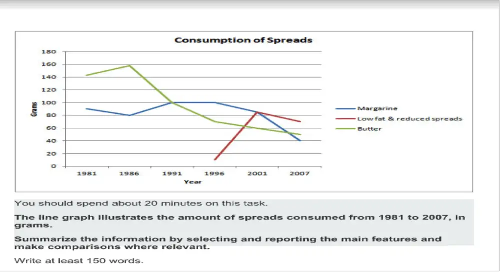
The graph gives information about the number of spreads (Margarine, low fat & reduced spread and butter) consumed from the year 1981 up to 2007. The units were measured in grams.
Overall, the highest consumed spread was butter which started as the most used among the three, whereas low fat and reduced spread were only introduced in 1996, however, all three spreads fluctuated within the end of the given time frame.
On the one hand, butter started strong with 140 grams consumed in the year 1981 but gradually decreased as the years progressed until it plummeted to nearly 50 grams used by 2007. Similarly, this can be seen in margarine with almost 90 grams used in 1981 then it slowly decreased in 1986. It reached a plateau in 1991 up to 1996 and gradually decreased reaching 40 grams used in 2007.
On the other hand, low fat & reduced spread was introduced in 1996. It gently rose from almost 10 grams used when it started then progressively increased reaching its highest peak in 2001 (80 grams) however like the two other spreads it slowly decreased up until 2007 were it garnered almost 60 grams.
Word count – 194 / Band score – 8
Task Achievement – The answer provides a paraphrased question, to begin with, followed by an overview that gives the reader key information.
Coherence and Cohesion – The answer has been divided into clear logical paragraphs.
Lexical Resource – There is evidence of paraphrasing, synonyms and some less common words.
Grammatical Range and Accuracy – The answer has no grammatical errors. The sentences are mainly made up of multiple clauses and have a variety of structures.
We hope you found this post helpful in helping you to study for the IELTS Test. Let us know in the comments or on the Facebook page if you have any questions. The best way to keep up to date with posts like this is to like us on Facebook, and then follow us onInstagramand Pinterest. We offer essay correction services, mock exams, and online courses. If you need help preparing for the IELTS Test, join the IELTS Achieve Academy and see how we can help you achieve your desired band score faster.
Step-by-step guide to answering this type of IELTS Writing Task 1 question. Covers structure, key language, and band-scoring criteria.
Originally published May 2018. Last reviewed 3 July 2026.
In this post, we will look at a Writing Task 1 Academic line graph essay example from the IELTS writing task 1 Academic Test. Students often ask if the questions are repeated year after year and the answer is no, but the type of chart or graph can be.
There are so many questions written each year, you may find you practice answering various questions on different topics. It is best practice to learn how to answer each one of the various types of writing task 1 questions, from bar charts, line graphs, maps, process etc.
If you would like to learn how to structure a charts and graphs essay please click the button below >
Take a look at the IELTS Writing Task 1 Academic essay example below >>
*This line graph question and answer were provided by a student. IELTS Achieve did not design this question*
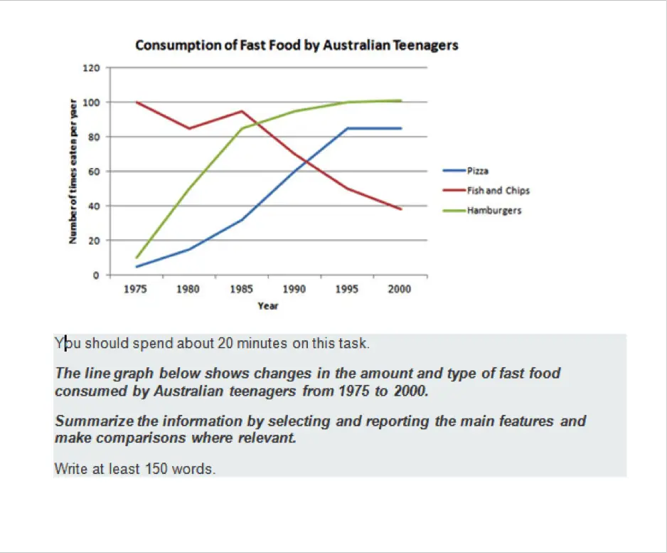
The line graph displays three varieties of fast foods (Hamburger, pizza and fish and chips) purchased by Australian teens over a 25-year period.
Overall, both pizza and hamburger consumption rose steadily as the years progressed until it remained steady by the year 2000, while fish and chips started strong at the beginning of the time period, then gradually plummeted reaching its lowest point at the end of 2000.
On the one hand, Australian teenagers didn’t opt to eat pizzas in 1975, as below 10 instances were recorded, however, as the years passed by, an upward trend can be observed in the number of pizzas consumed by Australian youths, as it reached its highest peak in 2000 at over 80 times per year. Similarly, the same can be said for eating hamburgers, below 20 hamburgers were consumed in 1975, this steadily increased until it reached its maximum peak at 100 hamburgers consumed per year by the year 2000.
On the other hand, fish and chips started out as being very popular. An average of a whopping 100 fish and chips were eaten in 1975 though it slightly decreased in 1980 (almost 80 times) then slowly rose again after 5 years ( 1985, 90 times) nonetheless it continued to decrease as the years passed by wherein the year 2000 it plummeted and reached its lowest peak at nearly 40 fish and chips.
Word count – 231 / Band score – 8
Task Achievement – The answer provides a paraphrased question, to begin with, followed by an overview that gives the reader key information.
Coherence and Cohesion – The answer has been divided into clear logical paragraphs.
Lexical Resource – There is evidence of paraphrasing, synonyms and some less common words.
Grammatical Range and Accuracy – The answer has no grammatical errors. The sentences are mainly made up of multiple clauses and have a variety of structures.
We hope you found this post helpful in helping you to study for the IELTS Test. Let us know in the comments or on the Facebook page if you have any questions. The best way to keep up to date with posts like this is to like us on Facebook, and then follow us onInstagramand Pinterest. We offer essay correction services, mock exams, and online courses. If you need help preparing for the IELTS Test, join the IELTS Achieve Academy and see how we can help you achieve your desired band score faster.
Step-by-step guide to answering this type of IELTS Writing Task 1 question. Covers structure, key language, and band-scoring criteria.
Originally published May 2017. Last reviewed 3 July 2026.
This post will help you to write a successful line graph essay, there is a model answer for you to compare your work to at the end of the post.
Remember that your essay should have a minimum of 150 words and ideally should be completed in 20 minutes.
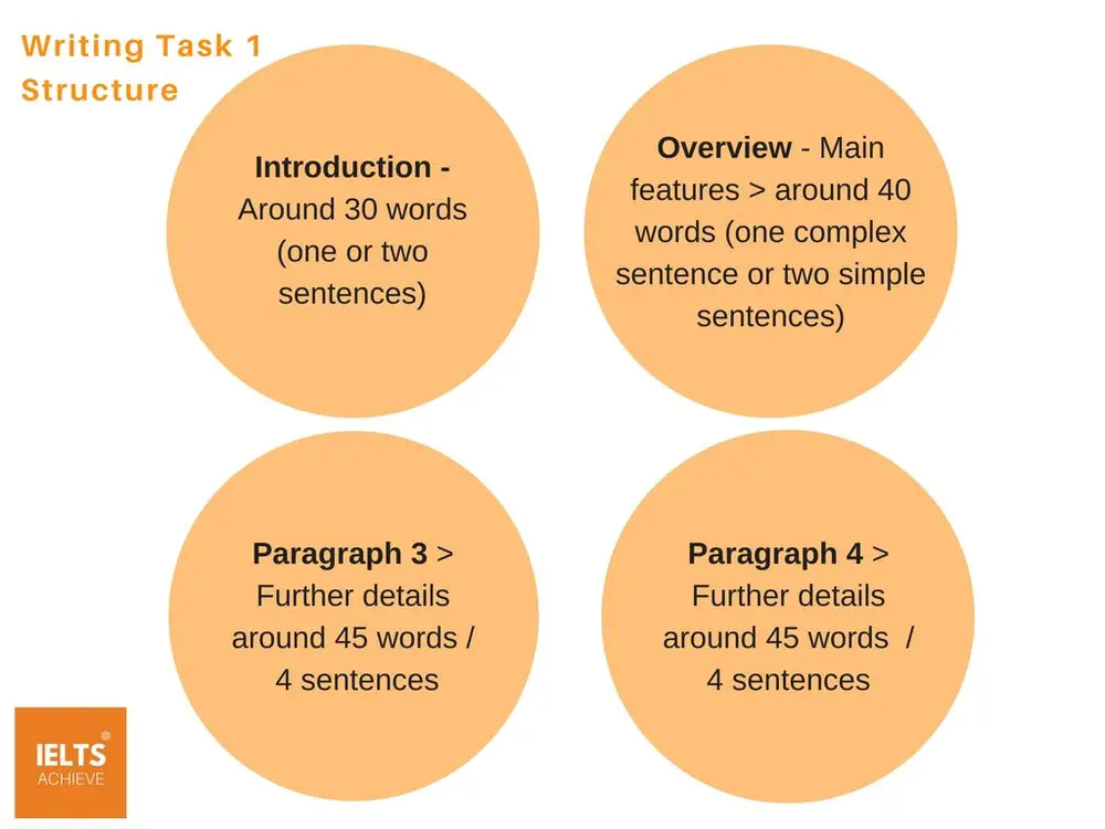
Line Graph Essay Structure
The writing task 1 essay should be as follows:
Sample Question: Line Graph
Read the question below carefully, what can you see in the information given?
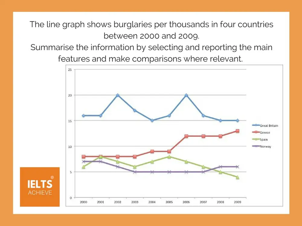
The line graph shows burglaries per thousand in four countries between 2000 and 2009. Summarise the information by selecting and reporting the main features and make comparisons where relevant.
STEP 1 – WRITE THE INTRODUCTION
Write your own introduction of one or two sentences, paraphrasing the question, using synonyms where you can.
STEP 2 – WRITE AN OVERVIEW
Write the overview – start this paragraph with the word ‘Overall...’ and write one or two sentences which describe the main features of the information presented in the line graph.
STEP 3 – WRITE THE MAIN BODY PARAGRAPHS
Write two main body paragraphs, going into detail and giving specific information about the graph. Remember to include data to support your findings. For example, look for the highs and lows and any major increases or decreases over time.
STEP 4 – CHECK YOUR WORK
When you have completed the essay, check it for any errors, spelling or grammar. Then check to see if you have included linking words that connect the information together, making it easy to read. For example, using the word ‘Overall..’ at the beginning of the overview paragraph. You can also use words like – on the one hand, on the other hand, furthermore, however, in addition, finally etc.
Model Answer for Line graph essay
To view more model answer for similar question please click the link below:
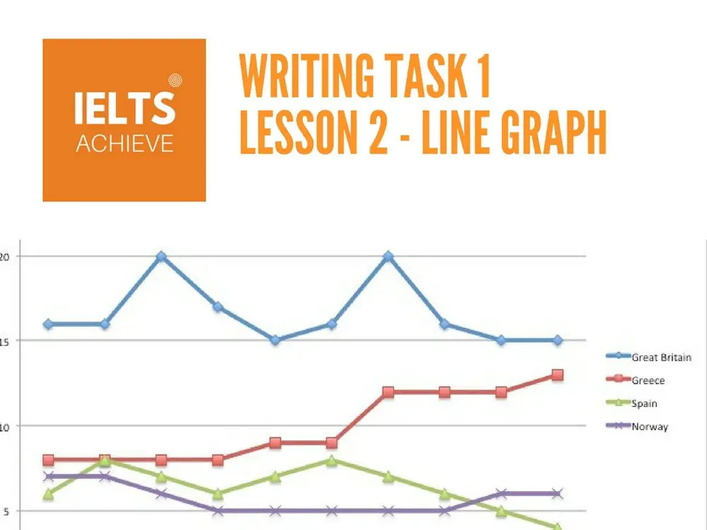
The graph illustrates comparative statistics on the number of burglaries in four countries (Great Britain, Greece, Spain and Norway) over a 10-year period (2000-2009). The units of thefts were measured in thousands.
Overall, the highest recurrence of burglary was in Great Britain, which was fairly high from 2000-2009 in comparison to the other countries, while the lowest incidence when the study began in 2000 was in Spain. It can be seen that in 2009 Spain reported slightly lower figures than the other four countries.
The graph shows that Great Britain’s burglaries were consistently high, never below the 20,000 mark, though the trend fluctuates over the 10-year period. According to the data, the country experienced the highest number of thefts during 2002 (20,000) and 2006 (20,000). However, it experienced its lowest amount stolen in 2009 at approximately 15,000.
Similarly, Spain experienced fluctuating trends, but on the opposite side of the spectrum as it reported the least amount of burglaries in 2000 (6,000) with frequency varying over the years and finally reporting a decline in 2009 (4,000). However, other notable statistics are Greece’s upward trend in the number of burglaries, which started in 2000 (8,000) and finally peaked at 14,000 during 2009. Norway is also noteworthy for having considerably low thefts over the course of 10 years compared to the other countries, dropping sharply in 2003, but increasing slightly from there, finally peaking at 6,000 slightly higher than Spain.