Step-by-step guide to answering this type of IELTS Writing Task 1 question. Covers structure, key language, and band-scoring criteria.
Originally published May 2018. Last reviewed 3 July 2026.
In this post, we will look at a Writing Task 1 Academic map essay example from the IELTS writing task 1 Academic Test. Students often ask if the questions are repeated year after year and the answer is no, but the type of map, process, graph or chart can be.
There are so many questions written each year, you may find you practice answering various questions on different topics. It is best practice to learn how to answer each one of the various types of writing task 1 questions, from bar charts, line graphs, maps, process etc.
If you would like to learn how to structure a map essay please click the button below >
Take a look at the IELTS Writing Task 1 Academic essay example below >>
*This map question and answer were provided by a student. IELTS Achieve did not design this question*
The two maps below show an island, before and after the construction of some tourist facilities.
Summarise the information by selecting and reporting the main features, and make comparisons where relevant.
The images show the changes on an island by building amenities for possible vacationers.
Overall, the island changed rapidly, as before development, the island was empty, with a beach and scattered palm trees. After the island had been developed, there were many new buildings, roads and a pier added, in order to attract tourists.
At first, the island was roughly 250 meters wide with a small beach located in the west. There were also areas for vegetation that were scattered around the area. Over a period of time, many facilities were constructed to make it more appealing to tourists. The accommodation units were built just beside the beach area and also in the middle section of the island. There were also footpaths constructed to help people to navigate the island smoothly.
After further development, tourists could swim at the beach located in the west of the island. A restaurant was built in the north of the island and just below a reception area was added. There are also vehicle tracks that connect both facilities. A pier was also constructed in the southern part of the island where sailboats can moor. Lastly, the eastern part of the island was not developed.
Word count – 200 / Band score 8
Task Achievement – The answer provides a paraphrased question, to begin with, followed by an overview that gives the reader key information.
Coherence and Cohesion – The answer has been divided into clear logical paragraphs.
Lexical Resource – There is evidence of paraphrasing, synonyms and some less common words.
Grammatical Range and Accuracy – The answer has no grammatical errors. The sentences are mainly made up of multiple clauses and have a variety of structures.
We hope you found this post helpful in helping you to study for the IELTS Test. Let us know in the comments or on the Facebook page if you have any questions. The best way to keep up to date with posts like this is to like us on Facebook, and then follow us onInstagramand Pinterest. We offer essay correction services, mock exams, and online courses. If you need help preparing for the IELTS Test, join the IELTS Achieve Academy and see how we can help you achieve your desired band score faster.
Step-by-step guide to answering this type of IELTS Writing Task 1 question. Covers structure, key language, and band-scoring criteria.
Originally published May 2018. Last reviewed 3 July 2026.
In this post, we will look at a Writing Task 1 Academic pie chart essay example from the IELTS writing task 1 Academic Test. Students often ask if the questions are repeated year after year and the answer is no, but the type of chart or graph can be.
There are so many questions written each year, you may find you practice answering various questions on different topics. It is best practice to learn how to answer each one of the various types of writing task 1 questions, from bar charts, line graphs, maps, process etc.
If you would like to learn how to structure a pie chart essay please click the button below >
Take a look at the IELTS Writing Task 1 Academic essay example below >>
*This pie chart question and answer were provided by a student. IELTS Achieve did not design this question*
The chart below shows how much money is spent in the budget on different sectors by the UAE government in 2000.
Summarize the information by selecting and reporting the main features, and make comparisons where relevant.
The diagram describes the comparative statistics of the annual expenditure of ten departments of the government of the United Arab Emirates in 2000. The units were measured in billion AED.
Overall, the Social security sector received the largest amount of budget while the Department of Transportation got the lowest amount of funds.
On the one hand, the receiver of the largest portion of the annual budget of the United Arab Emirates government in 2000 is the Social security sector with 100 billion AED followed by the Health and personal social services and the Education department with 53 billion AED and 38 billion AED respectively. Landing in the fourth spot is the other expenditures and the Debt sector with both 23 billion AED.
On the other hand, the Defense Department had 22 billion AED and trailing behind are the Departments of Law and order and the Housing, heritage and environment sector with 17 billion AED and 15 billion AED correspondingly. The Industry, agriculture and employment department received 13 billion AED and then finally, the Department of Transportation got the least amount of budget with only 9 billion AED.
Word count – 187 / Band score 8
Task Achievement – The answer provides a paraphrased question, to begin with, followed by an overview that gives the reader key information.
Coherence and Cohesion – The answer has been divided into clear logical paragraphs.
Lexical Resource – There is evidence of paraphrasing, synonyms and some less common words.
Grammatical Range and Accuracy – The answer has no grammatical errors. The sentences are mainly made up of multiple clauses and have a variety of structures.
We hope you found this post helpful in helping you to study for the IELTS Test. Let us know in the comments or on the Facebook page if you have any questions. The best way to keep up to date with posts like this is to like us on Facebook, and then follow us onInstagramand Pinterest. We offer essay correction services, mock exams, and online courses. If you need help preparing for the IELTS Test, join the IELTS Achieve Academy and see how we can help you achieve your desired band score faster.
Step-by-step guide to answering this type of IELTS Writing Task 1 question. Covers structure, key language, and band-scoring criteria.
Originally published May 2018. Last reviewed 3 July 2026.
In this post, we will look at a Writing Task 1 Academic multiple chart essay example from the IELTS writing task 1 Academic Test: Worldwide land degradation.
Students often ask if the questions are repeated year after year and the answer is no, but the type of chart or graph can be. There are so many questions written each year, you may find you practice answering various questions on different topics. It is best practice to learn how to answer each one of the various types of writing task 1 questions, from bar charts, line graphs, maps, process etc.
Take a look at the IELTS Writing Task 1 Multiple Charts and Graphs Academic essay example below:
*This multiple chart question and answer were provided by a student. IELTS Achieve did not design this question*
The Question is:
Worldwide land degradation
The pie chart below shows the main reasons why agricultural land becomes less productive. The table shows how these causes affected three regions of the world during the 1990s. Summarise the information by selecting and reporting main features, and make comparisons where relevant.
Causes of land degradation by region
Region
% land degraded by …
Deforestation
Over – cultivation
over – graing
total land degraded
North America
0.2
3.3
1.5
5%
Europe
9.8
7.7
5.5
23%
Ocenia*
1.7
0
11.3
13%
* A large group of islands in the South Pacific including Australia and New Zealand.
Take a look at the model answer.
The first diagram describes the comparative statistics of the 4 primary causes in the world of land deterioration, while the second chart illustrates the effects of this in three main continents mainly Oceania, North America and Europe in the year 1990. Overall, when it comes to reasons for land degradation, overgrazing garnered the highest percentage while the other category received the lowest fraction. Europe obtained the largest proportion of degraded land and North America had the lowest percentage obtained. On the one hand, overgrazing of farm animals established the primary reason for land deprivation with 35% followed by deforestation and over-cultivation with 30% and 28% respectively. With 7 % of the other reasons, the category had the smallest proportion. On the other hand, the European countries had the greatest proportion of degraded land with 23% with over-cultivation being the main reason trailed by Oceania and North America with 13% and 5% accordingly.
Word count – 150 / Band score 8
Instructor Feedback on Multiple Charts and Graphs Essay Modal Answer: Worldwide land degradation
Task Achievement – The answer provides a paraphrased question, to begin with, followed by an overview that gives the reader key information.
Coherence and Cohesion – The answer has been divided into clear logical paragraphs.
Lexical Resource – There is evidence of paraphrasing, synonyms and some less common words.
Grammatical Range and Accuracy – The answer has no grammatical errors. The sentences are mainly made up of multiple clauses and have a variety of structures.
We hope you found this post helpful in helping you to study for the IELTS Test. Let us know in the comments or on the Facebook page if you have any questions. The best way to keep up to date with posts like this is to like us on Facebook, and then follow us onInstagramand Pinterest. We offer essay correction services, mock exams, and online courses. If you need help preparing for the IELTS Test, join the IELTS Achieve Academy and see how we can help you achieve your desired band score faster.
Step-by-step guide to answering this type of IELTS Writing Task 1 question. Covers structure, key language, and band-scoring criteria.
Originally published May 2018. Last reviewed 3 July 2026.
In this post, we will look at a Writing Task 1 Academic multiple chart essay example from the IELTS writing task 1 Academic Test: Main reasons for migration.
Students often ask if the questions are repeated year after year and the answer is no, but the type of chart or graph can be. There are so many questions written each year, you may find you practice answering various questions on different topics. It is best practice to learn how to answer each one of the various types of writing task 1 questions, from bar charts, line graphs, maps, process etc.
Take a look at the IELTS Writing Task 1 Multiple Charts and Graphs Academic essay example below:
*This multiple chart question and answer were provided by a student. IELTS Achieve did not design this question*
The Question is:
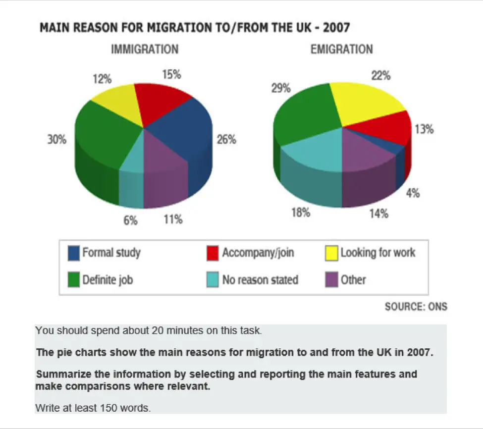
The main reason for migration
The pie charts show the main reasons for migration to and from the UK in 2007. Summarize the information by selecting and reporting the main features and make comparisons where relevant.
Write at least 150 words.
Take a look at the model answer.
The two charts illustrate the comparative statistics on the number of principal causes of travelling in and out from the UK in 2007. The units are measured in percentages and the source came from ONS. Overall, looking for work is the main purpose of migrating and emigrating to the UK while no reason stated had the lowest percentage of arrivals in the UK during 2007. It also can be seen that with regards to emigration, formal studies garnered the lowest fraction. On the one hand, the data shows that landing a worthy profession was consistently high in reasons for both going in and out of the country, 30% and 29% respectively. According to the data, there is a big difference in the percentage of formal studies in the UK, which gained 26% whereas only 4% were recorded of the number of people who studied outside of the UK in 2007. On the other hand, there is a slight difference between migrating (15%) and emigrating (13%) if the reason was to escort someone. The same can be seen in other purposes where 11% left for migration and 14% decided to emigrate respectively. However, the percentage doubled when looking for a job for both going in and out of the UK 12% and 22% correspondingly.
Word count – 213 / Band score 8
Instructor Feedback on Multiple Charts and Graphs Essay Modal Answer: Main reasons for migration
Task Achievement – The answer provides a paraphrased question, to begin with, followed by an overview that gives the reader key information.
Coherence and Cohesion – The answer has been divided into clear logical paragraphs.
Lexical Resource – There is evidence of paraphrasing, synonyms and some less common words.
Grammatical Range and Accuracy – The answer has no grammatical errors. The sentences are mainly made up of multiple clauses and have a variety of structures.
We hope you found this post helpful in helping you to study for the IELTS Test. Let us know in the comments or on the Facebook page if you have any questions. The best way to keep up to date with posts like this is to like us on Facebook, and then follow us onInstagramand Pinterest. We offer essay correction services, mock exams, and online courses. If you need help preparing for the IELTS Test, join the IELTS Achieve Academy and see how we can help you achieve your desired band score faster.
Step-by-step guide to answering this type of IELTS Writing Task 1 question. Covers structure, key language, and band-scoring criteria.
Originally published May 2018. Last reviewed 3 July 2026.
In this post, we will look at a Writing Task 1 Academic multiple chart essay example from the IELTS writing task 1 Academic Test. Students often ask if the questions are repeated year after year and the answer is no, but the type of chart or graph can be.
There are so many questions written each year, you may find you practice answering various questions on different topics. It is best practice to learn how to answer each one of the various types of writing task 1 questions, from bar charts, line graphs, maps, process etc.
If you would like to learn how to structure a multiple charts essay please click the button below >
Take a look at the IELTS Writing Task 1 Academic essay example below >>
*This multiple chart question and answer were provided by a student. IELTS Achieve did not design this question*
The bar chart gives information about the 5 main intentions of commuting in public in the US in 2009 while the pie chart illustrates the data with regards to the main concerns of Americans in using public transportation.
Overall, the main reason that Americans use public transport is to travel to their workplace and back home again whereas, they also highlighted that there are 6 problems that are usually encountered when travelling in public. The high cost of the fare topped their list while the area allotted to pedestrians was of the least concern.
On the one hand, there are five main purposes why Americans travelled in public in 2009. The main reason was travelling to and from work (49%) followed by personal reasons and shopping with 19% and 16% respectively. The data also shows that they used public transport for recreational purposes (10%) and lastly when they visited friends or relatives (6%).
On the other hand, the cost of travelling is their main issue in using public transportation garnering 36% while concerns about their safety came second with 19%. The data also illustrates concerns about aggressive drivers and traffic problems with 17% and 14% respectively. Accessibility to public vehicles and space for pedestrians were also mentioned with 8% and 6% correspondingly.
Word count – 212 / Band score – 8
Task Achievement – The answer provides a paraphrased question, to begin with, followed by an overview that gives the reader key information.
Coherence and Cohesion – The answer has been divided into clear logical paragraphs.
Lexical Resource – There is evidence of paraphrasing, synonyms and some less common words.
Grammatical Range and Accuracy – The answer has no grammatical errors. The sentences are mainly made up of multiple clauses and have a variety of structures.
We hope you found this post helpful in helping you to study for the IELTS Test. Let us know in the comments or on the Facebook page if you have any questions. The best way to keep up to date with posts like this is to like us on Facebook, and then follow us onInstagramand Pinterest. We offer essay correction services, mock exams, and online courses. If you need help preparing for the IELTS Test, join the IELTS Achieve Academy and see how we can help you achieve your desired band score faster.